

Spring brings the familiar rhythm of yearbook deadlines—editors huddled over layouts, design teams debating spreads, and advisors balancing creative vision with practical constraints. Every yearbook committee faces the same fundamental challenge: How do you create layouts that honor each student’s experience while producing a cohesive book that captures an entire school year? The answer lies in thoughtful design choices that balance creativity, functionality, and timeless appeal.
Yearbook layout decisions shape how students remember their school years. A well-designed spread draws readers in, guides their eyes naturally across pages, and creates visual interest without overwhelming content. Poor layouts, conversely, feel cluttered, confusing, or generic—failing to do justice to the memories they’re meant to preserve. The difference between memorable and forgettable yearbook design often comes down to understanding proven layout principles and adapting them to your school’s unique story.
This comprehensive guide showcases 25 yearbook layout ideas schools are successfully implementing in 2026, organized by spread type and design challenge. You’ll discover practical approaches for portraits, candids, sports, clubs, special events, and more—plus essential digital preservation strategies that ensure these carefully crafted layouts remain accessible to alumni for decades through archived digital flipbooks.
Yearbook design has evolved significantly beyond simple rows of portrait photos and generic event snapshots. Today’s successful yearbooks blend traditional documentation with creative storytelling, using layout choices that enhance rather than distract from content. Whether your team embraces minimalist grids or bold asymmetrical designs, understanding layout fundamentals helps you create pages students will actually want to revisit.

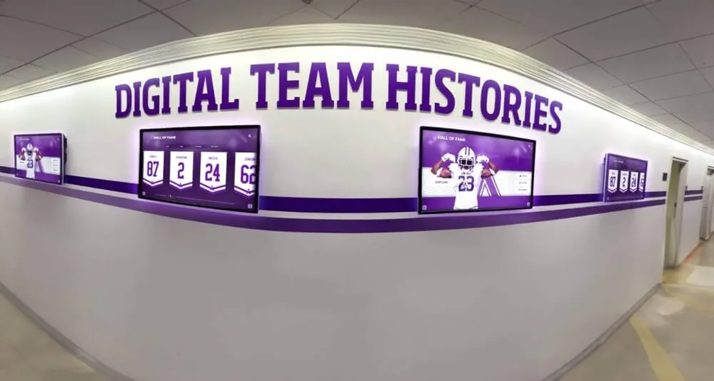
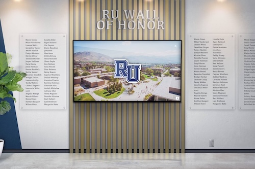
Modern yearbook layouts balance individual recognition with cohesive design—similar to how digital recognition systems preserve student memories
Essential Yearbook Layout Principles Before You Design
Before exploring specific layout ideas, understanding core design principles prevents common mistakes and creates visual consistency throughout your yearbook.
The Grid System Foundation
Professional yearbook layouts rely on underlying grid structures that create order and visual harmony:
Grid Structure Benefits
Grids provide invisible frameworks that organize content:
- Consistent alignment across spreads
- Natural eye flow from element to element
- Balanced white space distribution
- Easier collaboration among design team members
- Professional appearance without requiring advanced skills
Most successful yearbook layouts use 3-column, 4-column, or 5-column grids. Three-column grids offer flexibility for larger photos, four-column grids balance structure and variety, and five-column grids allow precise photo sizing for portrait pages.
Breaking the Grid Intentionally
Once established, grids can be strategically broken for emphasis:
- Feature photos bleeding beyond grid boundaries
- Diagonal elements creating dynamic movement
- Overlapping photos for depth
- Pull quotes or headlines spanning multiple columns
- Circular or shaped photo crops contrasting rectangular grid
The key is breaking grids purposefully rather than accidentally—deliberate rule-breaking creates visual interest while maintaining professional standards.
Visual Hierarchy and Eye Flow
Layout designs should guide readers’ eyes through content in intentional sequences:
Creating Clear Hierarchy
Use size, position, and visual weight to establish importance:
- Dominant photos anchor the spread
- Secondary elements support without competing
- Headlines clearly indicate content sections
- Captions provide context without cluttering
- White space creates breathing room
Readers naturally scan pages in F or Z patterns. Position your most important elements along these natural sight lines to ensure they’re noticed.
Color and Contrast Considerations
Effective use of color and contrast enhances readability:
- High contrast between text and backgrounds
- School colors reinforcing identity
- Limited color palettes preventing visual chaos
- Strategic pops of color drawing attention
- Consistent color schemes tying sections together
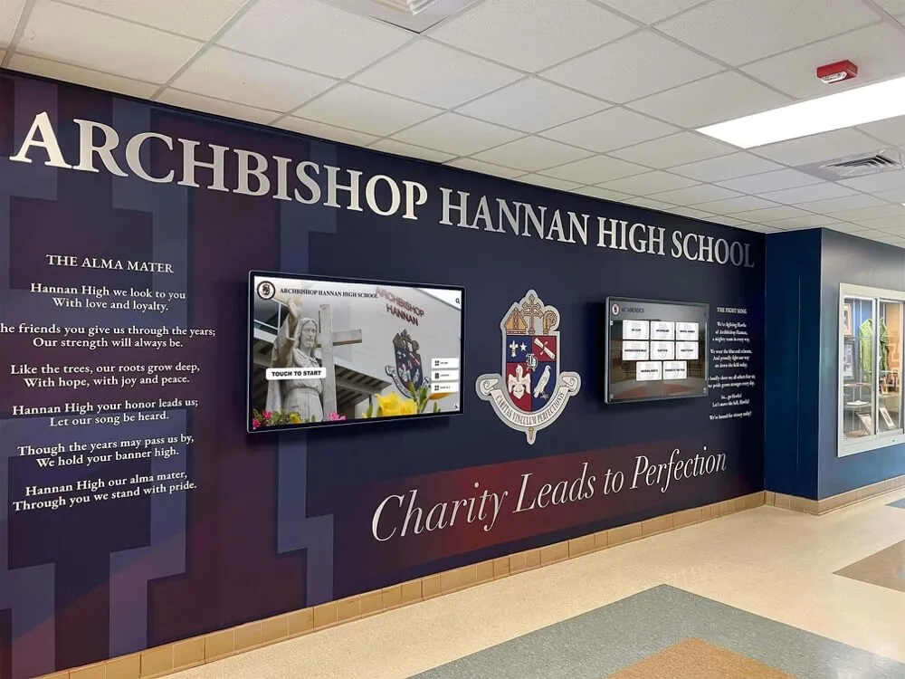
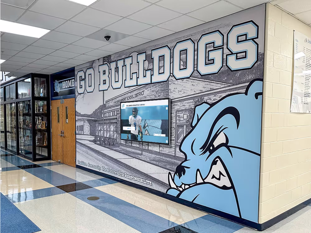
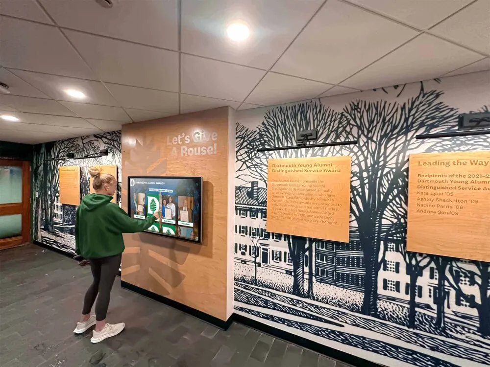
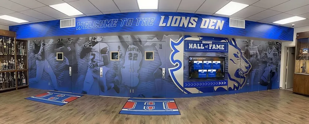
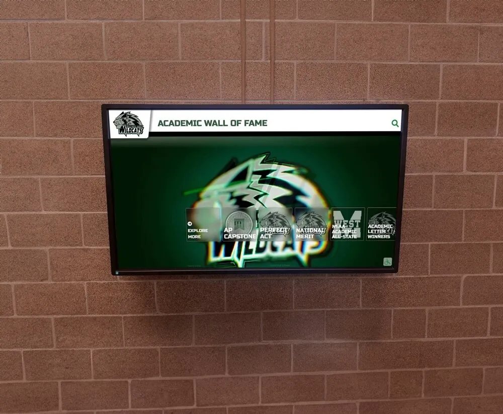
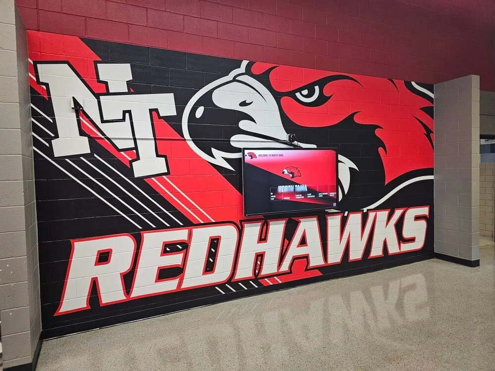
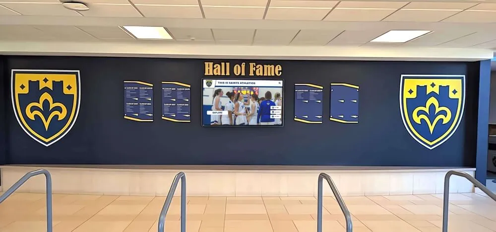
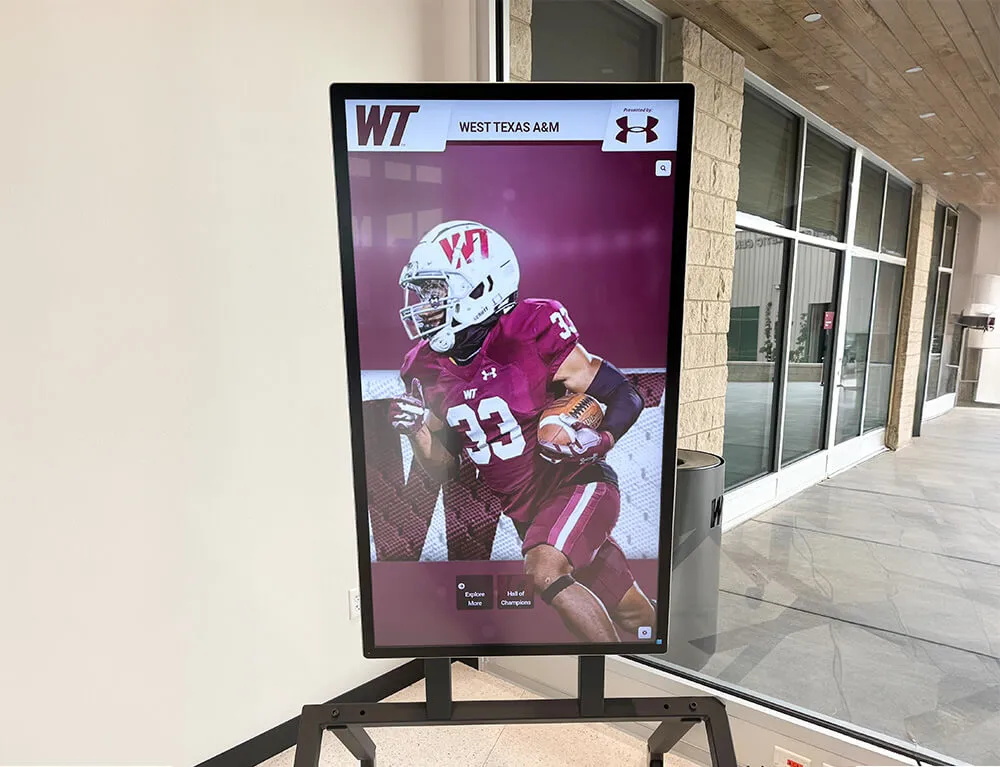
Schools implementing comprehensive recognition programs often use consistent visual branding across yearbooks and digital displays to strengthen school identity.
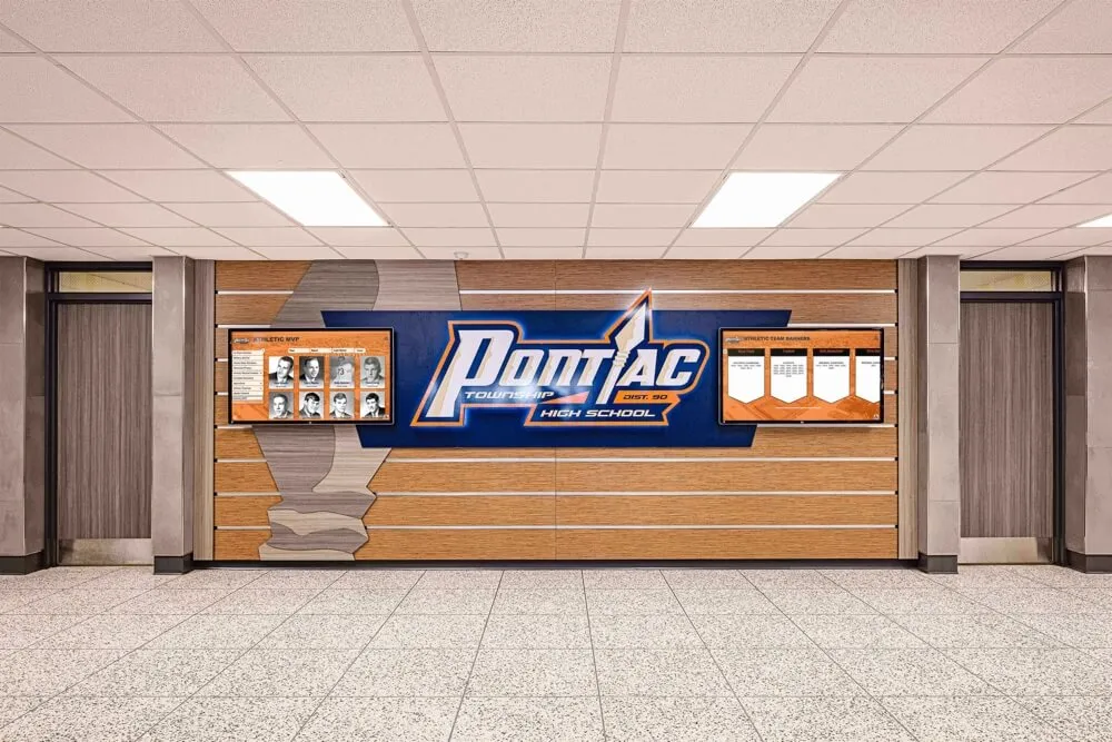
![]()
Visual consistency across yearbook layouts and school displays creates cohesive branding that students recognize
Portrait Layout Ideas: Individual and Class Photos
Portrait pages form the core of most yearbooks, documenting every student while maintaining visual interest across dozens of similar spreads.
Classic Grid Portrait Layouts
Traditional grid layouts remain popular for good reason—they’re fair, organized, and time-tested:
1. Uniform Grid with Alphabetical Order
The most straightforward approach places all portraits in consistent-sized boxes arranged alphabetically. This layout ensures equal representation and easy navigation.
Best for: Large schools prioritizing fairness and simplicity Design tip: Add visual interest through creative backgrounds, border treatments, or section headers
2. Staggered Grid Pattern
Portraits maintain consistent sizing but alternate between aligned and slightly offset positions, creating subtle visual rhythm without sacrificing organization.
Best for: Schools wanting traditional structure with modern feel Design tip: Use consistent offset measurements to avoid appearing accidental
3. Floating Portraits on Themed Backgrounds
Individual portraits remain standard-sized but “float” on creative backgrounds reflecting grade level themes, seasons, or school motifs.
Best for: Schools with strong visual identities or themed yearbooks Design tip: Ensure backgrounds enhance rather than distract from faces
Modern Portrait Layout Variations
Contemporary portrait designs break from rigid grids while maintaining organization:
4. Mixed-Size Portrait Clusters
Groups of 4-6 portraits feature one slightly larger photo among standard-sized images, creating focal points while preserving fairness through rotation—every student appears as the featured photo on at least one spread.
Best for: Medium-sized schools with experienced design teams Design tip: Plan rotation carefully to ensure equal representation
5. Hexagonal or Geometric Shape Grids
Instead of rectangles, portraits appear in consistent hexagons, circles, or other geometric shapes arranged in appealing patterns.
Best for: Schools embracing contemporary design trends Design tip: Ensure shapes don’t crop faces awkwardly
6. Timeline or Journey Layouts
Portraits arrange along timeline graphics showing student progression, seasonal changes, or school year journey metaphors.
Best for: Smaller schools with space for creative concepts Design tip: Balance creative concept with portrait prominence
Senior Portrait Showcase Designs
Senior sections often allow additional creativity and space:
7. Full-Page Senior Features
Select seniors receive full-page or half-page features including larger portraits, quotes, statistics, and personal information beyond standard listings.
Best for: Schools with senior-focused yearbook traditions Design tip: Establish clear, fair criteria for featured selections
8. Senior Superlatives and Awards Pages
Dedicated spreads showcasing senior superlatives categories with creative photo treatments and playful layout designs.
Best for: Schools with established superlatives traditions Design tip: Keep categories respectful and inclusive
9. Senior Reflections Collage
Combines senior portraits with childhood photos, quotes about high school experience, and college/career plans in magazine-style layouts.
Best for: Schools prioritizing personal storytelling Design tip: Create templates ensuring consistency despite varied content
Candid and Event Layout Ideas
Candid photos and event coverage require different layout approaches than portraits, emphasizing storytelling and energy.
Action and Energy Layouts
Capture the movement and emotion of school events:
10. Overlapping Action Sequences
Multiple photos from the same event overlap slightly, creating motion sense and showing progression of moments.
Best for: Sports events, performances, and competitions Design tip: Use chronological order to enhance sequence effect
11. Dominant Photo with Supporting Thumbnails
One large dramatic photo anchors the spread while smaller images provide context and multiple perspectives on the event.
Best for: Major events deserving comprehensive coverage Design tip: Choose dominant photo carefully—it sets the tone
12. Diagonal Energy Layouts
Photos arranged along diagonal lines create dynamic movement and visual excitement appropriate to active content.
Best for: Athletic events, pep rallies, and high-energy activities Design tip: Balance diagonal elements with stabilizing horizontal or vertical anchors
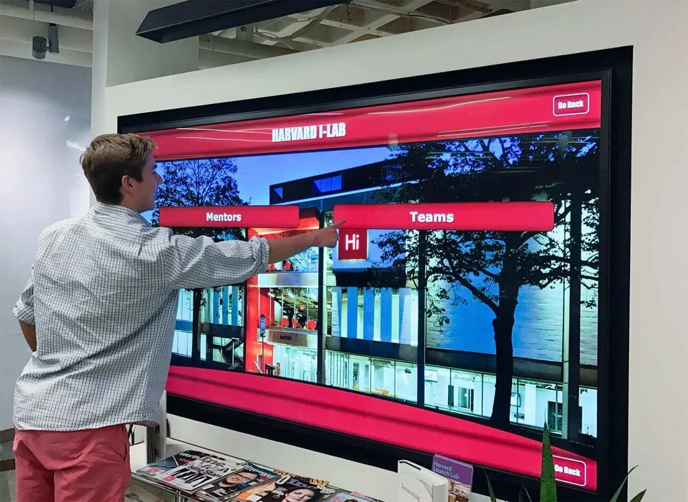
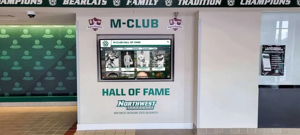
![]()
Athletic programs benefit from dynamic visual displays—both in yearbook layouts and permanent digital recognition systems
Storytelling Narrative Layouts
Events deserve coverage that conveys atmosphere and story:
13. Photo Essay Format
Treats event coverage like photojournalism, with sequential images telling a story from setup through conclusion, accompanied by narrative captions.
Best for: Major school traditions, overnight trips, or complex events Design tip: Include behind-the-scenes and preparation moments
14. Before/During/After Triptych
Three-part layouts showing event evolution create beginning-middle-end narrative structures.
Best for: Events with clear progression like homecoming preparations, performances, or competitions Design tip: Maintain visual connection between three sections
15. Quoted Moment Layouts
Large pull quotes from participants or observers overlay or intersect with related photos, adding voice and personality to visual content.
Best for: Events generating memorable reactions or comments Design tip: Verify quotes accurately and attribute clearly
Inclusive Coverage Layouts
Ensure broad student representation across event coverage:
16. Grid of Faces or Reactions
Collection of cropped faces or reaction shots from event attendees ensures many students appear even when full-body photos aren’t available.
Best for: Assemblies, audiences, and large gatherings Design tip: Crop consistently and ensure variety in expressions
17. Multiple-Event Comparison Layouts
Similar events from different seasons or teams share spreads with parallel layout structures highlighting similarities and differences.
Best for: Annual traditions, seasonal sports, or recurring activities Design tip: Use consistent framing to enable easy comparison
Sports and Athletics Layout Ideas
Athletic coverage requires layouts conveying competition intensity while documenting team rosters and accomplishments.
Team Coverage Designs
Balance team documentation with action photography:
18. Team Photo with Action Overlay
Traditional team portrait anchors one side while action photos from season highlights overlap or border the formal shot.
Best for: Comprehensive team coverage in limited space Design tip: Ensure team photo remains clearly visible despite overlays
19. Season Timeline Graphics
Visual timeline showing season progression with photos from key games, tournaments, or meets integrated into chronological design.
Best for: Championship teams or historically significant seasons Design tip: Include wins/losses or scores for context
20. Individual Athlete Spotlights
Feature layouts highlighting team captains, record-breakers, or letter-winners with statistics, quotes, and action shots.
Best for: Recognizing exceptional athletic achievements Design tip: Establish fair criteria for selection
Championship and Achievement Layouts
Special recognition for exceptional accomplishments:
21. Trophy and Awards Display Designs
Photographs of actual trophies, medals, and awards combine with team photos and achievement descriptions in display-case-inspired layouts.
Best for: Schools with significant athletic successes Design tip: Photograph awards professionally with consistent lighting
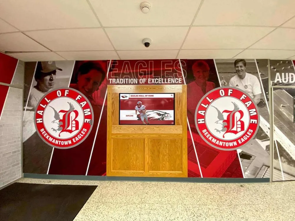
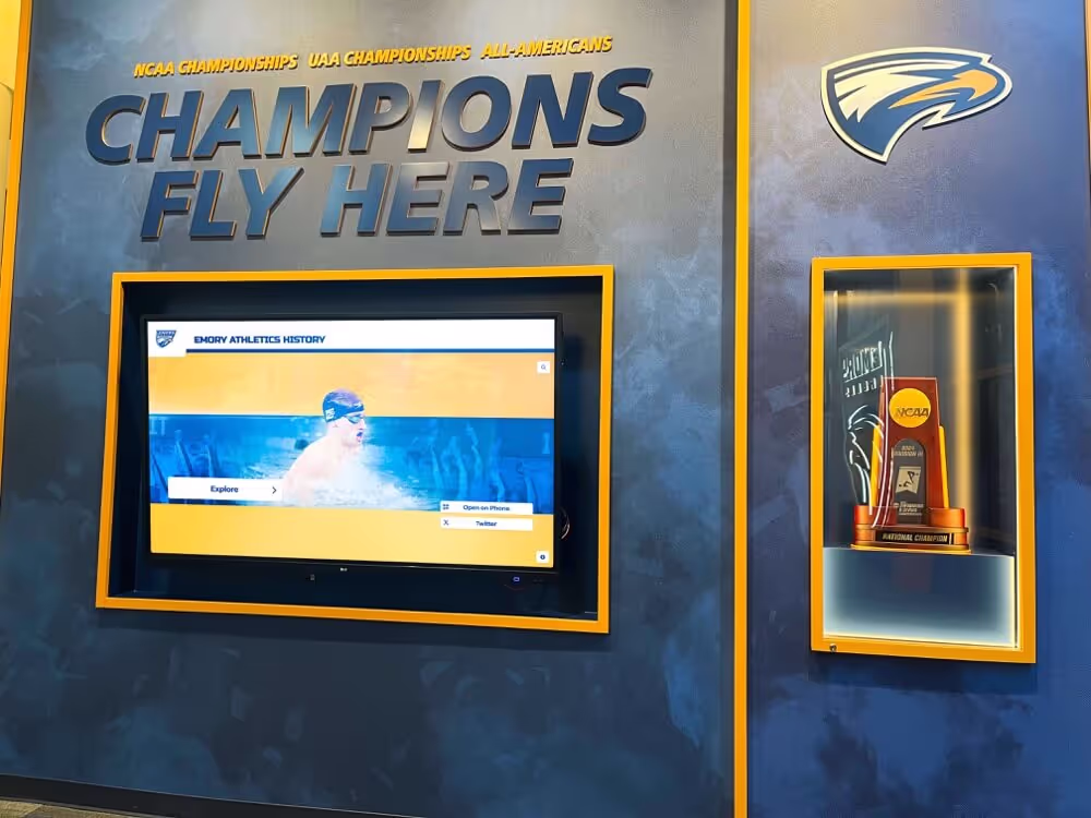
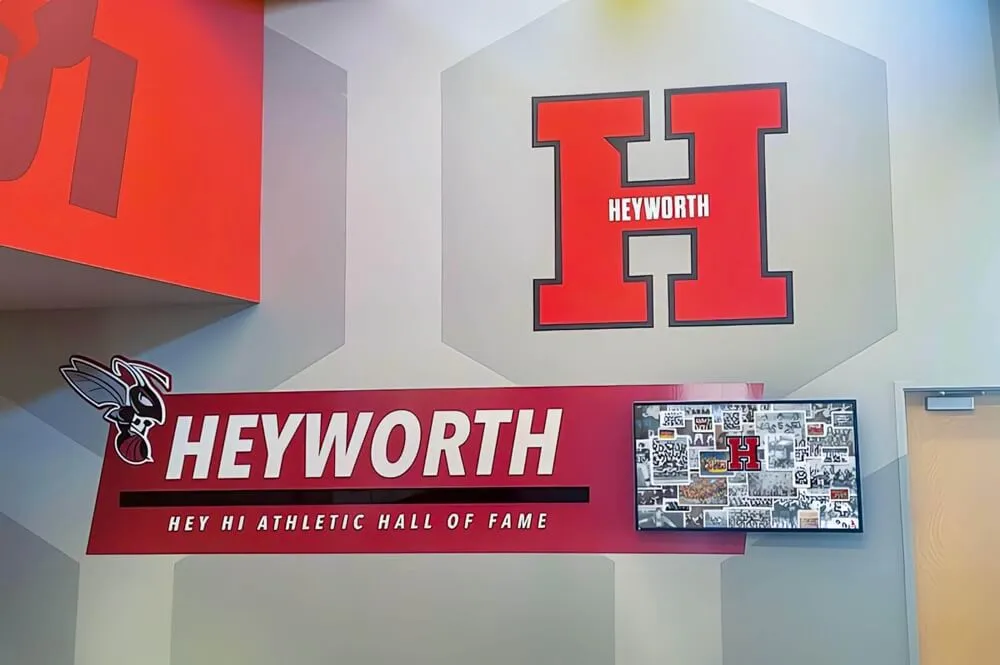
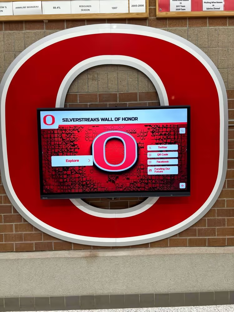
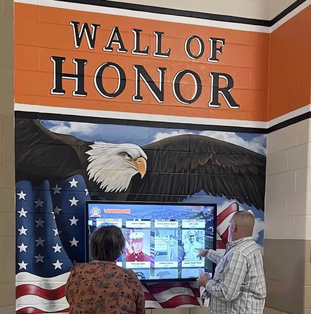
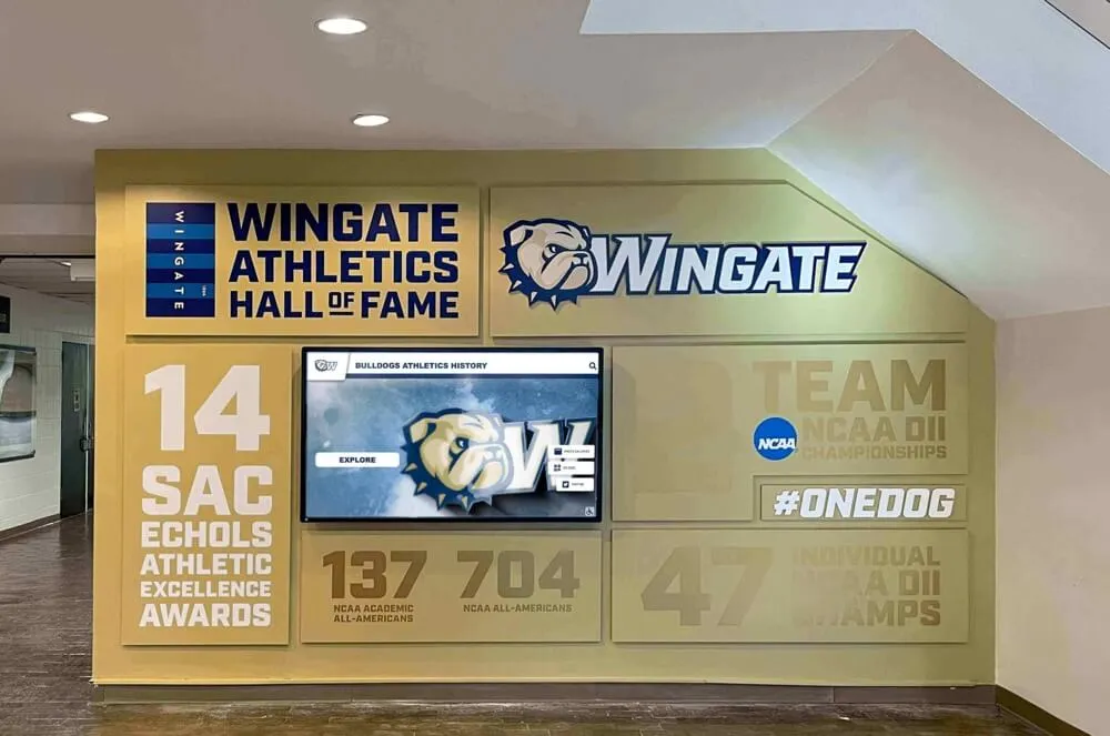
Many schools complement yearbook athletic coverage with permanent digital trophy cases that continuously celebrate achievements and inspire current athletes.

Schools create lasting athletic pride through yearbook layouts and permanent digital displays at high-traffic locations
Clubs, Organizations, and Academic Layout Ideas
Non-athletic programs deserve creative coverage showcasing diverse student involvement.
Club and Organization Layouts
Document the breadth of extracurricular opportunities:
22. Activity Montage Designs
Multiple photos from club activities, meetings, and events arrange in mosaic or collage formats showing variety of involvement and participation.
Best for: Active clubs with diverse activities Design tip: Include both formal group photos and candid activity shots
23. Icon and Infographic Layouts
Custom icons representing different organizations combine with photos, membership statistics, and accomplishments in modern infographic-style designs.
Best for: Schools with many clubs requiring efficient space usage Design tip: Maintain consistent icon style across all organizations
24. Student Work Showcase Layouts
Art, writing, research, and projects created by students become layout elements themselves, with creator photos and descriptions integrated around actual work samples.
Best for: Academic programs, art classes, and creative organizations Design tip: Photograph or scan work professionally for best reproduction
Schools increasingly provide digital gallery spaces where student work remains accessible year-round, complementing limited yearbook space.
Academic Achievement Layouts
Recognition for scholarly accomplishments:
25. Honor Roll and Awards Recognition
Clean, dignified layouts listing academic achievers with photos when possible, using formatting that emphasizes achievement while maintaining readability.
Best for: Documenting honor roll, National Honor Society, and academic awards Design tip: Proofread names meticulously—errors in recognition sections cause lasting disappointment

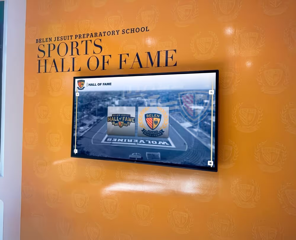
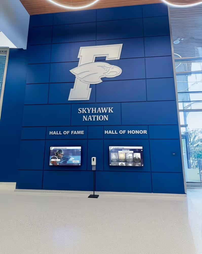
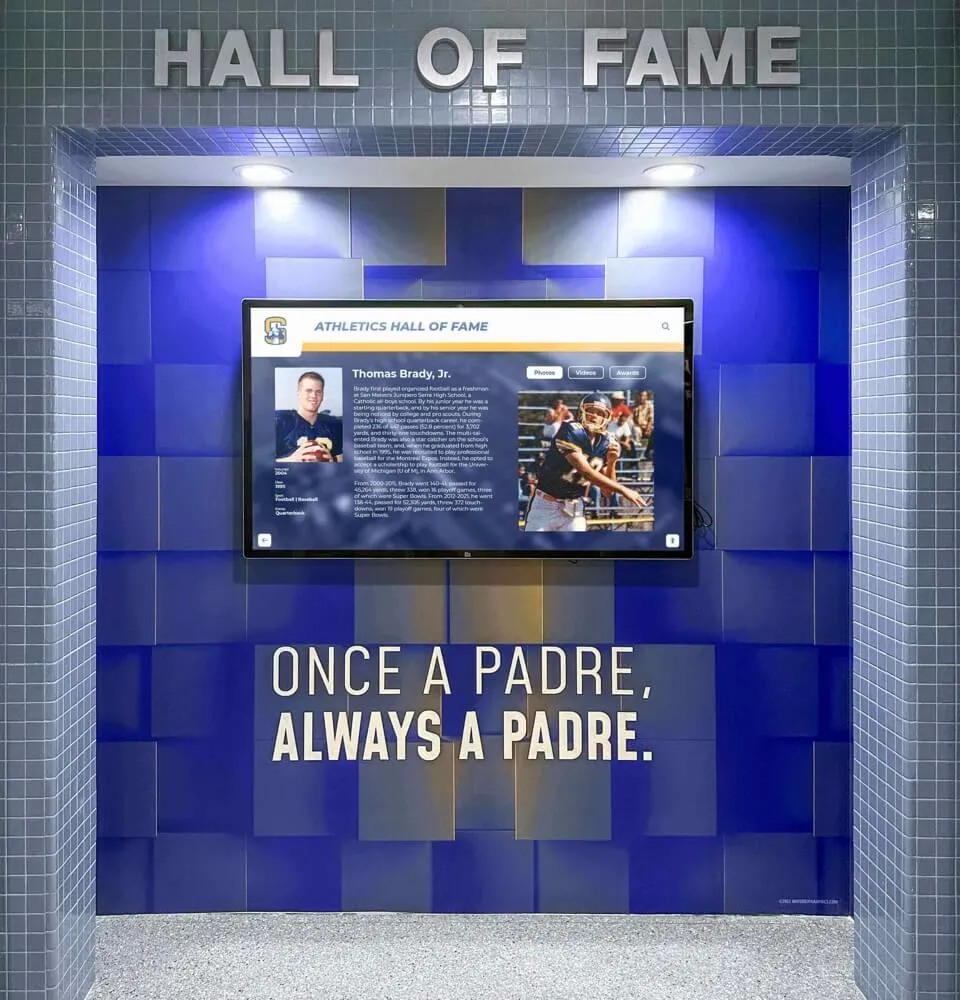
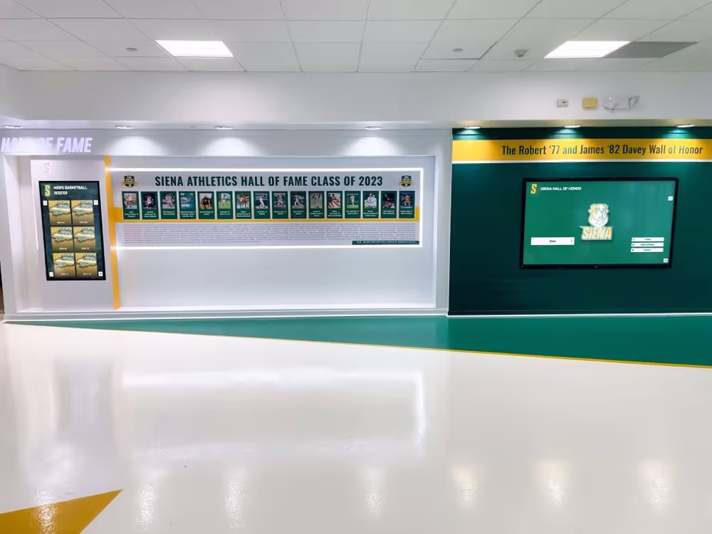
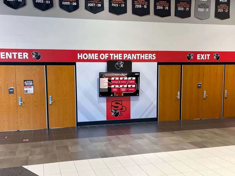
Academic and athletic achievements deserve permanent recognition through both yearbook documentation and year-round digital displays
Digital Preservation: Archiving Your Yearbook for Alumni Access
After investing months in layout design and production, ensuring yearbooks remain accessible to alumni for decades requires thoughtful digital preservation strategies.
Why Digital Yearbook Preservation Matters
Physical yearbooks face inevitable challenges over time:
Physical Yearbook Limitations
Even well-maintained yearbooks encounter:
- Damage from handling, water, or environmental factors
- Loss during moves or life transitions
- Limited accessibility—only one person can view at a time
- Deterioration of binding and pages over decades
- No sharing capability with distant family or friends
Alumni frequently contact schools seeking yearbook access after losing their copies or wanting to share memories with children. Digital archives solve these access challenges while preserving carefully crafted layouts permanently.
Digital Archive Advantages
Properly digitized yearbooks offer benefits impossible with physical copies:
- Unlimited simultaneous access for entire alumni community
- Search functionality finding specific names or content
- Zoom capability revealing details in group photos
- Sharing via links rather than shipping physical books
- Protection against loss or damage to originals
- Integration with alumni networks and reunion planning
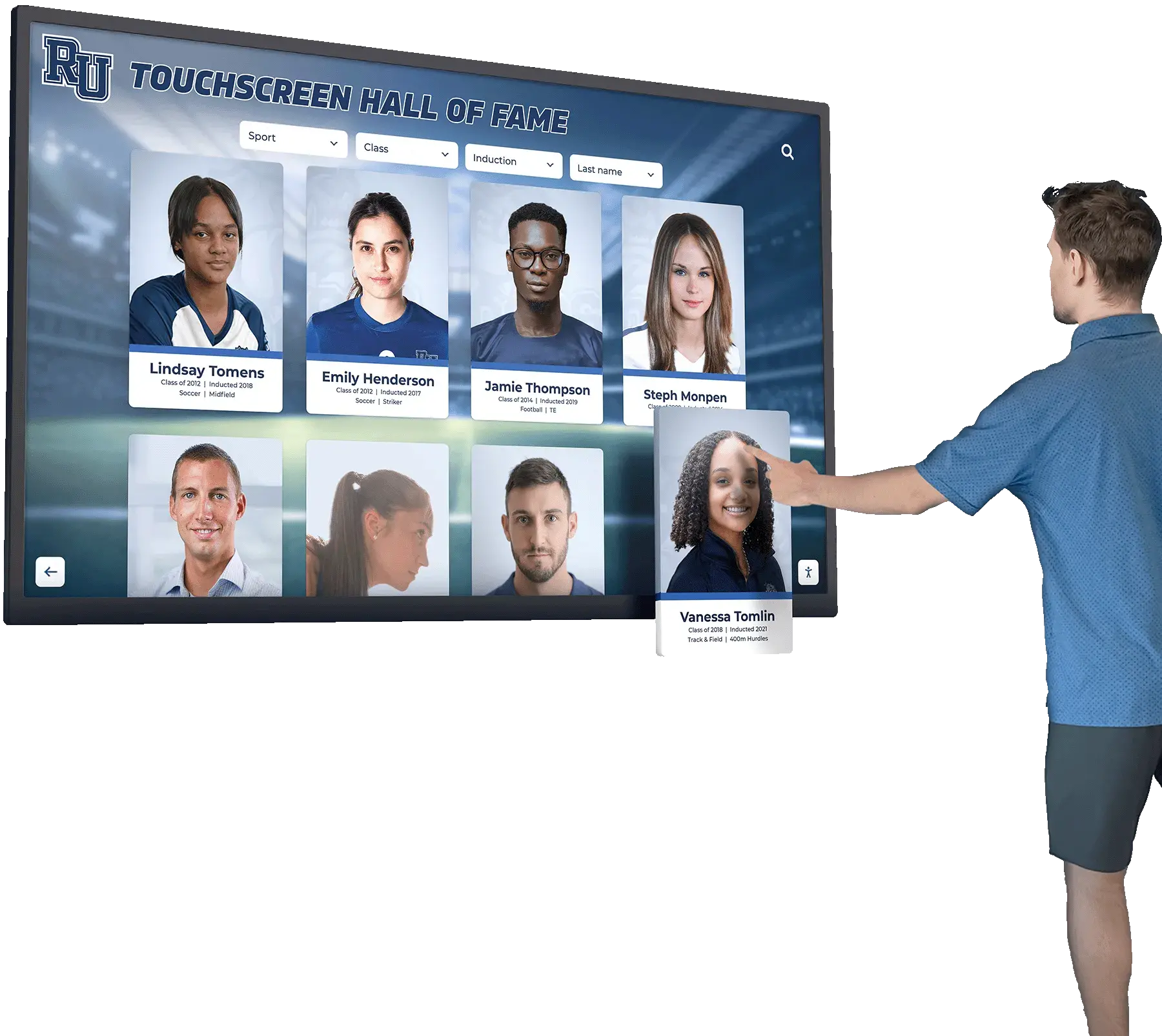
Schools implementing digital history archives create permanent resources connecting current students with institutional history while serving alumni communities.
Professional Yearbook Scanning and Digitization
Converting physical yearbooks to high-quality digital formats requires appropriate methods:
Scanning Methods and Standards
Professional digitization follows specific standards:
- Minimum 300 DPI resolution for text readability
- 600 DPI for photographs requiring zoom capability
- Color-accurate scanning preserving original design
- Page-by-page scanning capturing full spreads
- OCR (Optical Character Recognition) enabling text search
Professional yearbook scanning services ensure consistent quality across all pages while handling delicate older yearbooks safely.
Digital Flipbook Formats
Modern yearbook archives use interactive flipbook software that:
- Recreates natural page-turning experience
- Displays full spreads as designed
- Allows zoom without quality loss
- Enables sharing specific pages via direct links
- Works on all devices—computers, tablets, and phones
- Includes search functionality finding names instantly
Digital flipbooks preserve the spread-based layout design work your team invested in, unlike simple PDF files that often display pages individually.
Creating Accessible Alumni Yearbook Archives
Making digitized yearbooks available to your community requires planning:
Access and Privacy Considerations
Balance accessibility with appropriate privacy:
- Alumni-only access protecting student privacy
- Password protection or authentication requirements
- Opt-out options for individuals preferring exclusion
- Clear policies about downloading and sharing
- Compliance with student privacy regulations
Most schools restrict digital yearbook access to verified alumni and current community members rather than public internet access.
Platform and Hosting Options
Several approaches for hosting digital yearbook archives:
- School website integration with existing alumni sections
- Dedicated alumni platform subscriptions
- Cloud storage with controlled sharing permissions
- Specialized yearbook archive services
- Integration with digital recognition systems
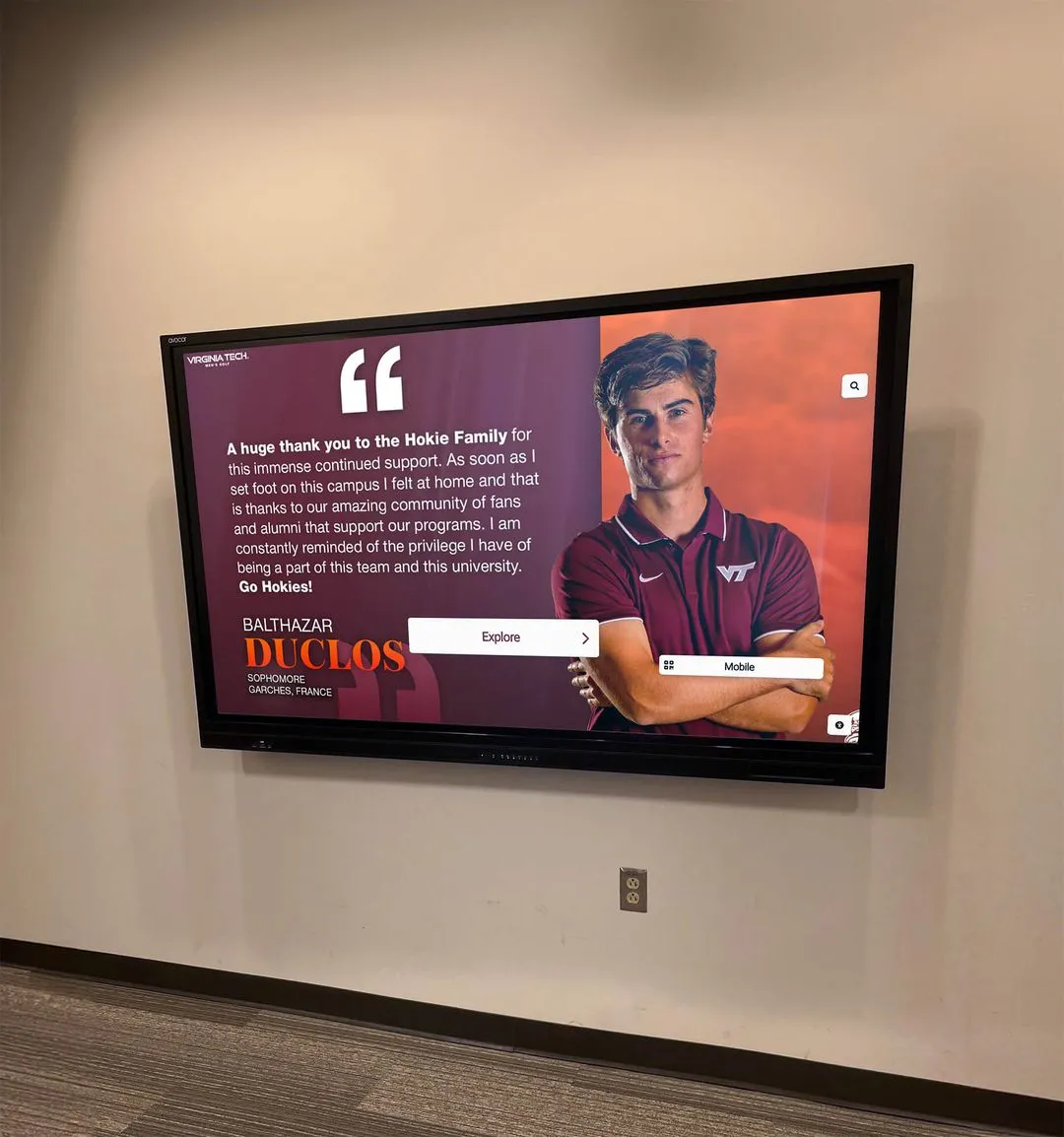
Comprehensive solutions combine yearbook archives with ongoing student recognition, creating continuity between historical documentation and current achievement celebration. These integrated platforms become central hubs where alumni reconnect with their school years while current students see their place in continuing traditions.
Metadata and Search Optimization
Enhance digital archive usability through proper indexing:
Essential Metadata Elements
Include searchable information for each yearbook:
- School year and date range
- Grade levels included
- Sports seasons covered
- Major events and milestones
- Club and organization rosters
- Individual student names when permitted
Comprehensive metadata transforms static archives into dynamic research tools allowing specific searches beyond simple page browsing.
Ongoing Archive Updates
Digital preservation isn’t one-time effort:
- Annual additions of new yearbooks
- Retrospective scanning of historical yearbooks
- Quality improvements as technology advances
- Link updates maintaining functionality
- Format migrations preserving long-term accessibility
Schools with 50+ year yearbook collections create extraordinary alumni resources by systematically digitizing historical archives alongside current publications.
Technical Specifications for Print-Ready Yearbook Layouts
Understanding technical requirements prevents costly printing errors and ensures your layouts reproduce as designed.
Resolution and Image Quality
Digital layouts require specific file specifications:
Photo Resolution Standards
Yearbook printing demands high-resolution images:
- Minimum 300 DPI at final printed size
- 200 DPI absolute minimum for acceptable quality
- Higher resolution for images requiring cropping
- Consistent resolution across all spread elements
- Color mode in CMYK rather than RGB
Low-resolution photos pulled from social media or websites reproduce poorly in print. Establish minimum resolution requirements and check all images before finalizing layouts.
Color Management and Proofing
Printed colors differ from screen colors:
Color Space Considerations
- Design in CMYK color space matching printing process
- Understand that bright screen colors don’t translate directly to print
- Proof printed samples before full production
- Account for paper color affecting final appearance
- Use Pantone or specific school color codes for consistency
Request printed proofs of signature spreads—particularly those with critical color matching like school branding elements—before approving full print runs.
Bleed, Margins, and Safe Zones
Printing mechanics require layout accommodations:
Critical Layout Zones
- Bleed: extend backgrounds 1/8 inch beyond trim edge
- Margin: keep text and faces 1/4 inch from trim
- Gutter: avoid critical content in center binding area
- Safe zone: keep important elements well within margins
- Trim allowance: account for slight cutting variations
Photos spanning full spreads require careful positioning ensuring faces don’t disappear into binding gutters. Test print and fold sample spreads to check gutter positioning.
Yearbook Design Software and Tools
Selecting appropriate design tools affects workflow efficiency and final quality.
Professional Design Platforms
Most schools use specialized yearbook design software:
Dedicated Yearbook Software
- Pre-built templates matching printer specifications
- Ladder planning and coverage tracking
- Collaboration tools for team workflows
- Direct submission to printing partners
- Training and support resources
Popular platforms include Walsworth’s Yearbook Avenue, Jostens’ Yearbook Avenue, Herff Jones’ YearTech, and Balfour’s Passport.
General Design Software
Some experienced teams prefer professional design applications:
- Adobe InDesign for maximum creative control
- Affinity Publisher as cost-effective alternative
- Canva for teams without design experience
- Photoshop/Illustrator for custom graphics
Professional software offers unlimited creative possibilities but requires steeper learning curves and doesn’t include yearbook-specific features like coverage tracking.
Collaboration and Workflow Tools
Yearbook production involves many contributors:
Team Coordination Platforms
- Shared cloud storage for photos and files
- Project management tools tracking assignments
- Communication platforms coordinating deadlines
- Version control preventing file conflicts
- Approval workflows for administrative review
Establish clear file naming conventions, folder structures, and backup procedures preventing lost work and deadline chaos.
Preserve Your Yearbook Layouts as Permanent Digital Archives
Transform your yearbook into a permanent digital flipbook accessible to alumni for decades. Rocket Alumni Solutions helps schools create searchable digital archives that preserve your design work while serving your alumni community. Discover how interactive touchscreen displays and digital preservation platforms ensure that the layouts you're creating this year remain accessible to your school community for generations.
Explore Digital Archive SolutionsLayout Selection Strategies for Your Yearbook Team
Choosing appropriate layouts for your specific yearbook requires considering school size, student culture, team capabilities, and available resources.
Matching Layouts to School Size and Culture
Different approaches work better for different school environments:
Small School Considerations (Under 500 Students)
Smaller schools can embrace layouts that larger schools find impractical:
- More space per student allowing creative portrait treatments
- Comprehensive event coverage without space constraints
- Experimental designs with manageable coordination
- Personal touches and individual recognition
- Narrative storytelling approaches
Small schools should avoid layouts that emphasize quantity over quality or feel like they’re imitating larger institution approaches.
Large School Considerations (Over 1,500 Students)
Large schools face different challenges requiring efficient layouts:
- Consistent portrait grids ensuring fairness and manageability
- Strategic event coverage prioritizing major moments
- Efficient space usage documenting hundreds of students
- Systematic approaches team members can replicate
- Clear organization helping readers navigate content
Large schools excel when embracing their scale rather than fighting it—using consistency and comprehensiveness as strengths rather than limitations.
School Culture Reflection
Layouts should reflect your specific school personality:
- Traditional schools: classic designs with subtle contemporary updates
- Arts-focused schools: experimental layouts showcasing creativity
- Athletic powerhouses: dynamic action-oriented designs
- Diverse communities: inclusive layouts representing all students
- Tech-oriented schools: modern minimalist or digital-inspired aesthetics
The best yearbooks feel authentically connected to their specific schools rather than following generic yearbook templates.
Balancing Creativity and Consistency
Yearbooks need variety without chaos:
Creating Visual Themes
Establish unifying elements appearing throughout the book:
- Consistent color palette tying sections together
- Recurring graphic elements or motifs
- Uniform font selections and text styling
- Signature layout patterns adapted across contexts
- Clear section divisions with consistent transitions
Visual themes create cohesive feel while allowing layout variety within established frameworks.
Section-Specific Approaches
Different yearbook sections allow different design approaches:
- Student Life: creative, energetic, varied layouts
- Portraits: consistent, fair, organized layouts
- Sports: dynamic, action-oriented layouts
- Academics: clean, professional, dignified layouts
- Special Features: experimental, unique, memorable layouts
Varying approaches by section prevents monotony while maintaining overall cohesion through established visual themes.
Team Skill Assessment
Choose layouts matching your team’s capabilities:
Layout Complexity Considerations
Be realistic about what your team can execute well:
- Experienced teams: complex custom layouts and experimental designs
- New teams: proven templates with moderate customization
- Limited time: efficient systematic approaches
- Small teams: simplified layouts reducing coordination needs
- Large teams: collaborative layouts with clear task division
Better to execute simple layouts excellently than struggle with complex designs producing inconsistent results. Your team’s second or third yearbook can embrace additional complexity after establishing workflows.
Common Yearbook Layout Mistakes to Avoid
Learning from frequent design errors saves time and improves final quality.
Overcrowding and Clutter
The most common yearbook layout mistake is trying to fit too much content:
Signs of Overcrowding
- No white space allowing visual rest
- Competing elements without clear hierarchy
- Text too small for comfortable reading
- Photos sized too small to see faces clearly
- Every inch of page filled with something
Effective layouts embrace white space and restraint, allowing featured content to breathe and register with readers.
Solutions for Content Overload
- Curate photos ruthlessly—show fewer excellent images rather than many mediocre ones
- Extend to additional spreads rather than cramming single spread
- Use supplemental online galleries for comprehensive coverage
- Accept that not every moment requires documentation
- Trust that representative coverage tells complete story
Quality always trumps quantity in yearbook design.
Inconsistent Typography
Text handling affects readability and professionalism:
Typography Errors
- Too many different fonts creating visual chaos
- Insufficient contrast between text and backgrounds
- Font sizes too small, particularly for captions
- Inconsistent text alignment and spacing
- Decorative fonts in body text reducing readability
Typography Best Practices
- Limit to 2-3 font families maximum throughout entire book
- Establish clear hierarchy: headlines, subheads, body text, captions
- Minimum 8-point font size for any text
- High contrast between text and background colors
- Consistent styling for similar content elements
Professional typography looks effortless but requires consistent discipline.
Poor Photo Quality and Cropping
Layout success depends on photo quality:
Photo Problems
- Low resolution images appearing pixelated or blurry
- Awkward crops cutting off heads or critical elements
- Inconsistent photo quality across same spread
- Poor lighting making subjects difficult to see
- Distracting backgrounds competing with subjects
Photo Excellence Strategies
- Establish minimum resolution standards and enforce them
- Crop intentionally, considering composition and subject
- Edit photos consistently for color and exposure balance
- Reshoot inadequate photos when possible rather than using poor quality
- Position photos where quality issues are least noticeable when compromise necessary
No layout design rescues bad photos, but good layouts showcase excellent photography effectively.
Ignoring Gutter and Margin Issues
Technical printing realities affect layout functionality:
Common Mechanical Errors
- Faces positioned in binding gutters becoming invisible
- Text extending too close to page edges risking trim-off
- Spreads designed without considering physical binding
- Critical content in questionable zones
- Inconsistent margins creating unprofessional appearance
Mechanical Success Strategies
- Print test spreads and physically fold them checking gutter issues
- Use software guidelines marking safe zones and bleeds
- Review spreads as physical two-page units rather than individual pages
- Account for binding method—saddle-stitch vs. perfect bound
- Request printer specifications and follow them precisely
Mechanical printing mistakes are completely preventable through careful attention to technical specifications.
Adapting Trends While Maintaining Timelessness
Yearbooks should feel current without appearing dated in future decades.
Identifying Lasting vs. Fleeting Trends
Some design trends endure while others quickly date yearbooks:
Enduring Design Approaches
- Clean typography and generous white space
- Strong photography and thoughtful composition
- Balanced asymmetry and intentional alignment
- Authentic candid moments over posed artificiality
- Quality materials and professional production
These approaches remain appealing across decades because they prioritize fundamental design principles over temporary fashions.
Quickly-Dating Trends
Be cautious with trendy elements that may not age well:
- Extremely popular filter effects or photo treatments
- Slang or meme references requiring contemporary context
- Overly stylized fonts tied to specific eras
- Design gimmicks without functional purpose
- Technology-dependent features that may not remain accessible
Subtle incorporation of contemporary elements acknowledges current moment without overwhelming timeless documentation.
Creating Modern Classics
The best yearbooks balance contemporary and enduring qualities:
Modern Classic Characteristics
- Updated interpretations of proven layout structures
- Current without trying too hard to be trendy
- Clean design that doesn’t distract from content
- Personality reflecting school culture authentically
- Quality that respects subjects and honors memories
Twenty years from now, alumni should recognize their yearbook as “from around 2026” but still find it appealing and well-designed rather than embarrassingly dated.
The Lasting Impact of Thoughtful Yearbook Layouts
Yearbook layout decisions shape how thousands of students remember formative years. A well-designed spread draws readers in naturally, highlights what matters, and creates visual experience worthy of the memories being documented. Poor layouts, conversely, fail to serve the content they’re meant to showcase—no matter how good the photos or how significant the moments.
The 25 layout ideas presented here represent starting points rather than rigid templates. The most successful yearbooks adapt proven approaches to their specific schools, students, and stories. They balance structure and creativity, consistency and variety, comprehensive coverage and thoughtful curation. They honor every student while highlighting exceptional moments. And increasingly, they plan for digital preservation ensuring these carefully crafted layouts remain accessible long after physical books deteriorate.
As you develop layouts for your yearbook, remember that you’re creating more than an annual publication—you’re producing a permanent archive that students will revisit throughout their lives. Alumni will show these pages to their children. Returning graduates will flip through spreads at reunions. And decades from now, your school community will reference these layouts when researching institutional history and celebrating traditions.
This responsibility need not feel overwhelming. Rather, it offers the privilege of documenting a complete school year in ways that honor every participant and preserve memories that might otherwise fade. The layout decisions you make this spring will serve your school community for generations—particularly when paired with thoughtful digital preservation ensuring permanent accessibility.
Modern schools increasingly complement traditional yearbooks with comprehensive digital recognition systems that preserve student achievements and memories in searchable, always-accessible formats. These platforms work alongside yearbooks rather than replacing them, offering year-round celebration of student accomplishments and alumni connection tools that extend far beyond annual publication cycles. Together, printed yearbooks and digital archives create complete memory preservation systems serving school communities across decades.
Take time selecting layouts worthy of the memories you’re documenting. Study what other schools do well and adapt their approaches to your context. Prioritize consistency and quality over trying to innovate every spread. And remember that the best yearbook layouts disappear into their content—they organize, showcase, and enhance without calling attention to themselves. When alumni decades from now remember their yearbook fondly, they’ll recall the people, moments, and memories—which means your layouts succeeded perfectly.